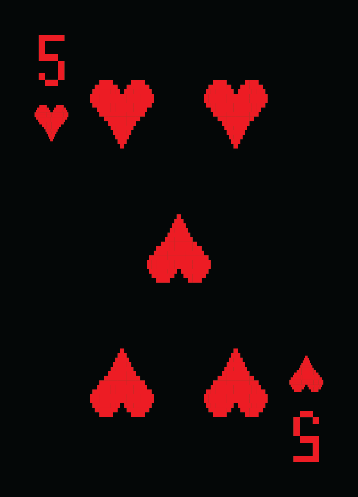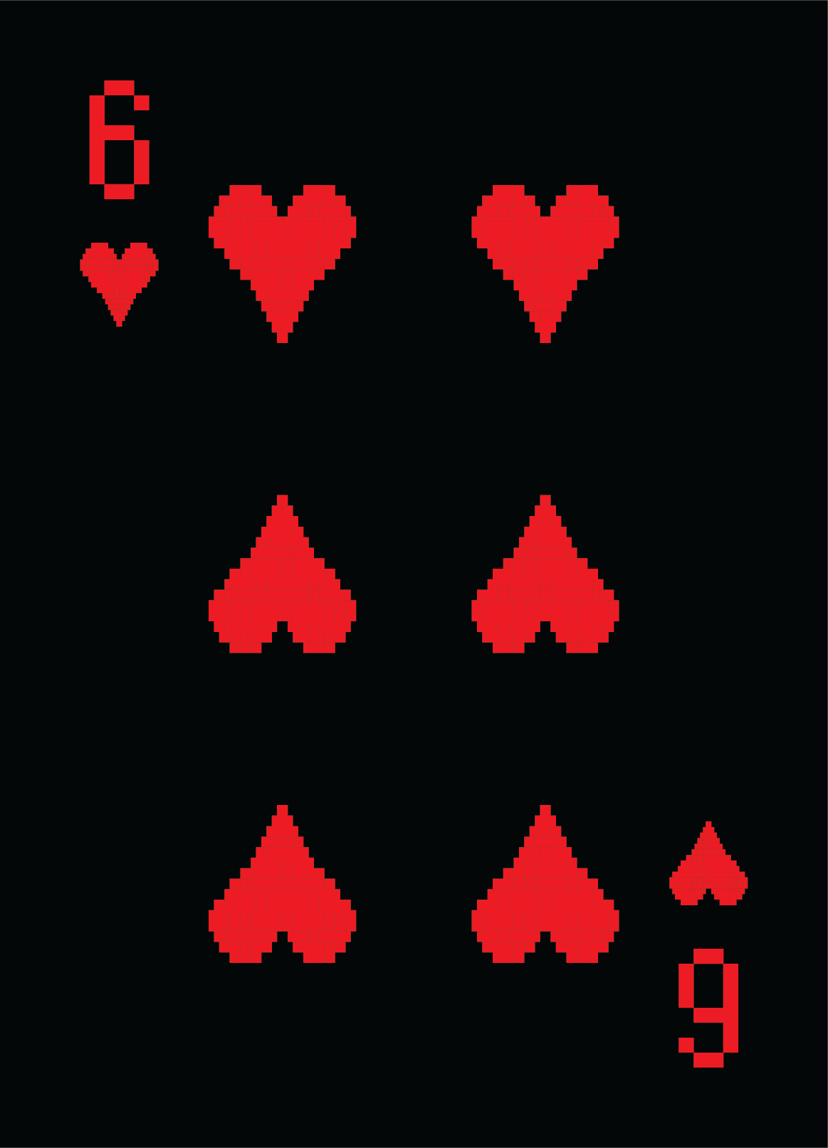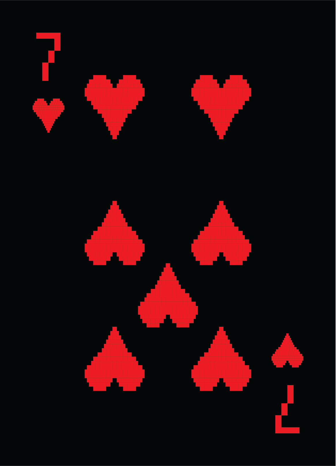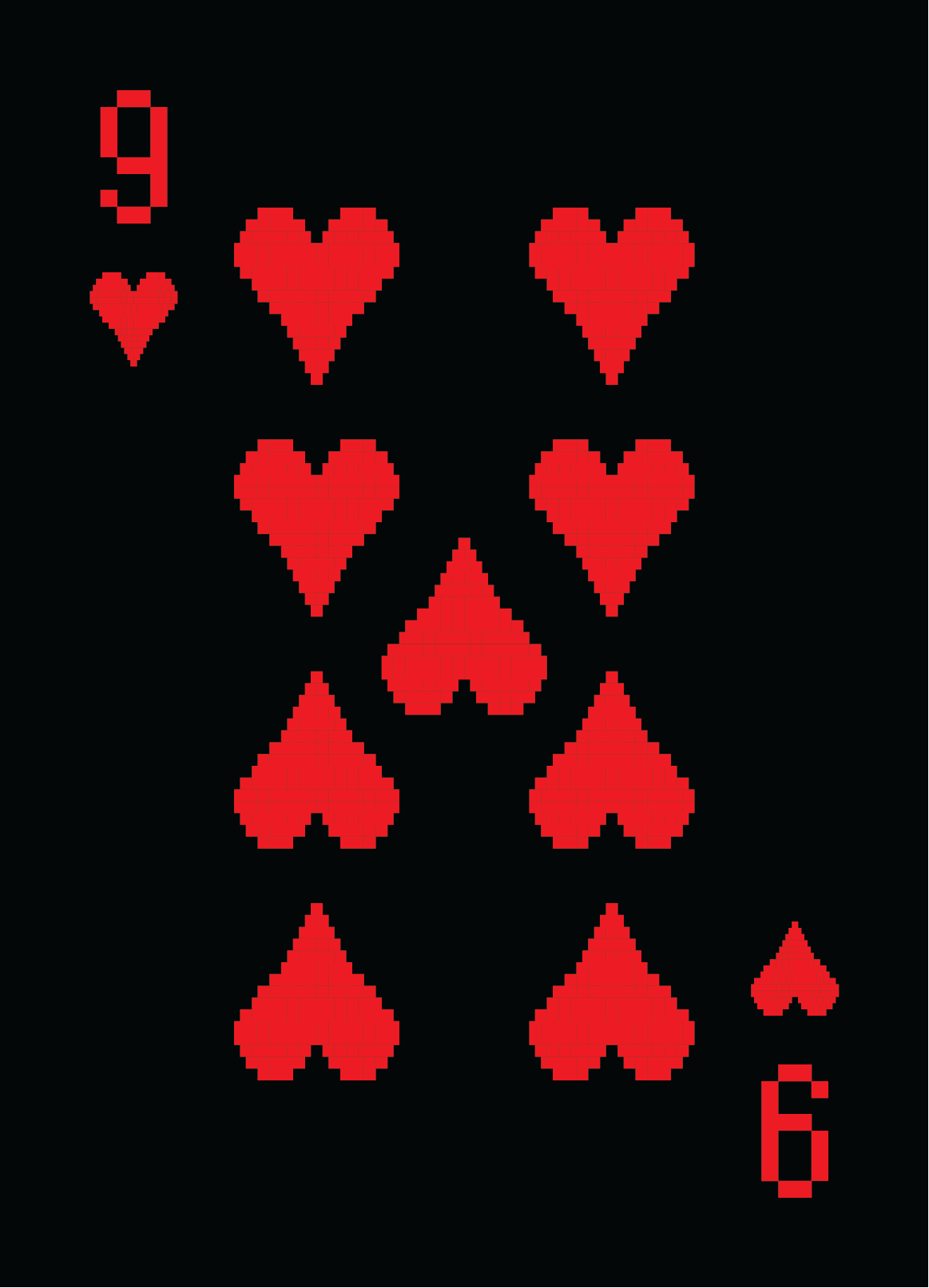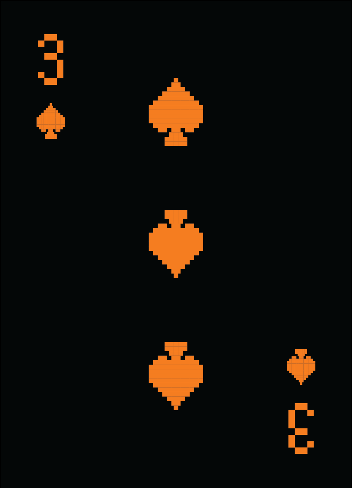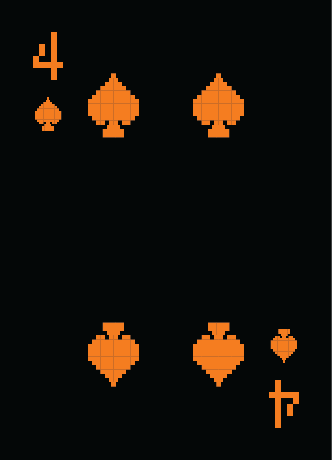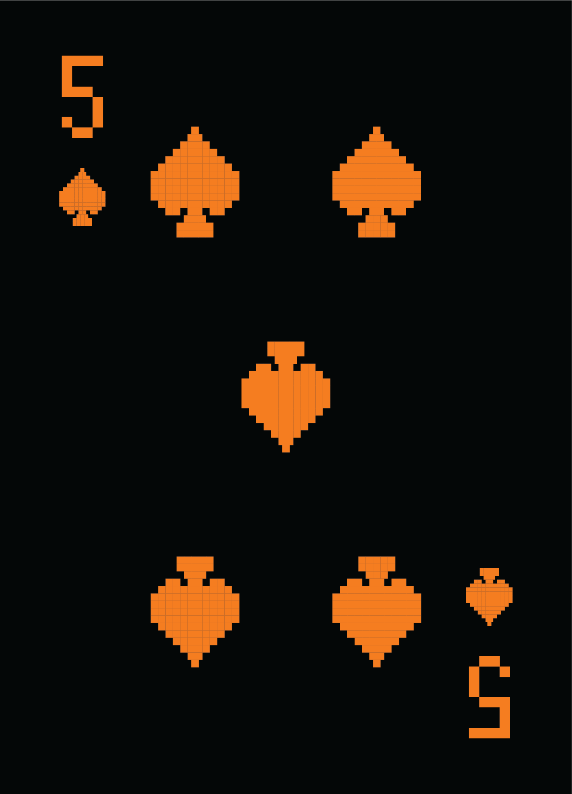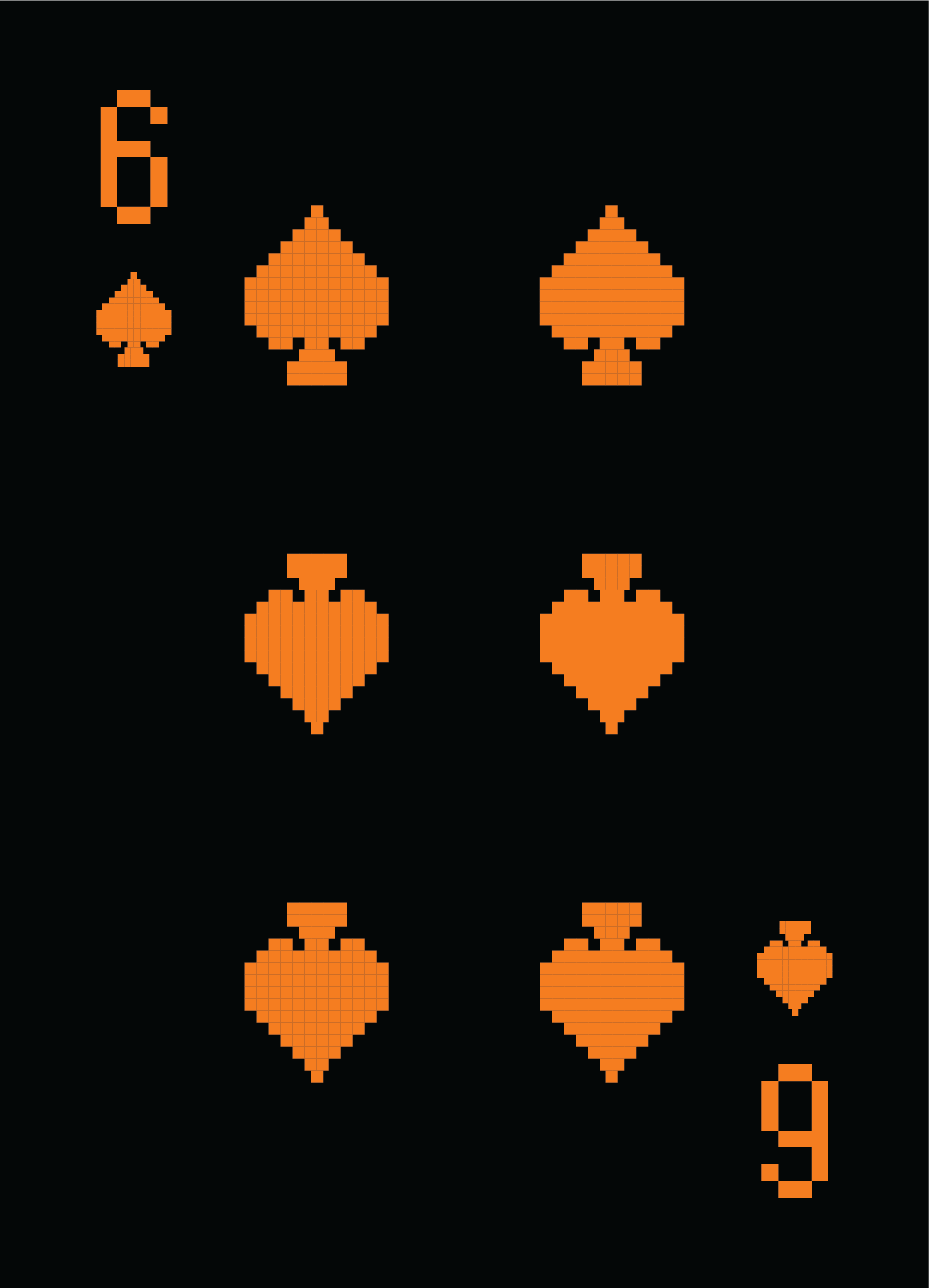
PAC-MAN Playing Cards
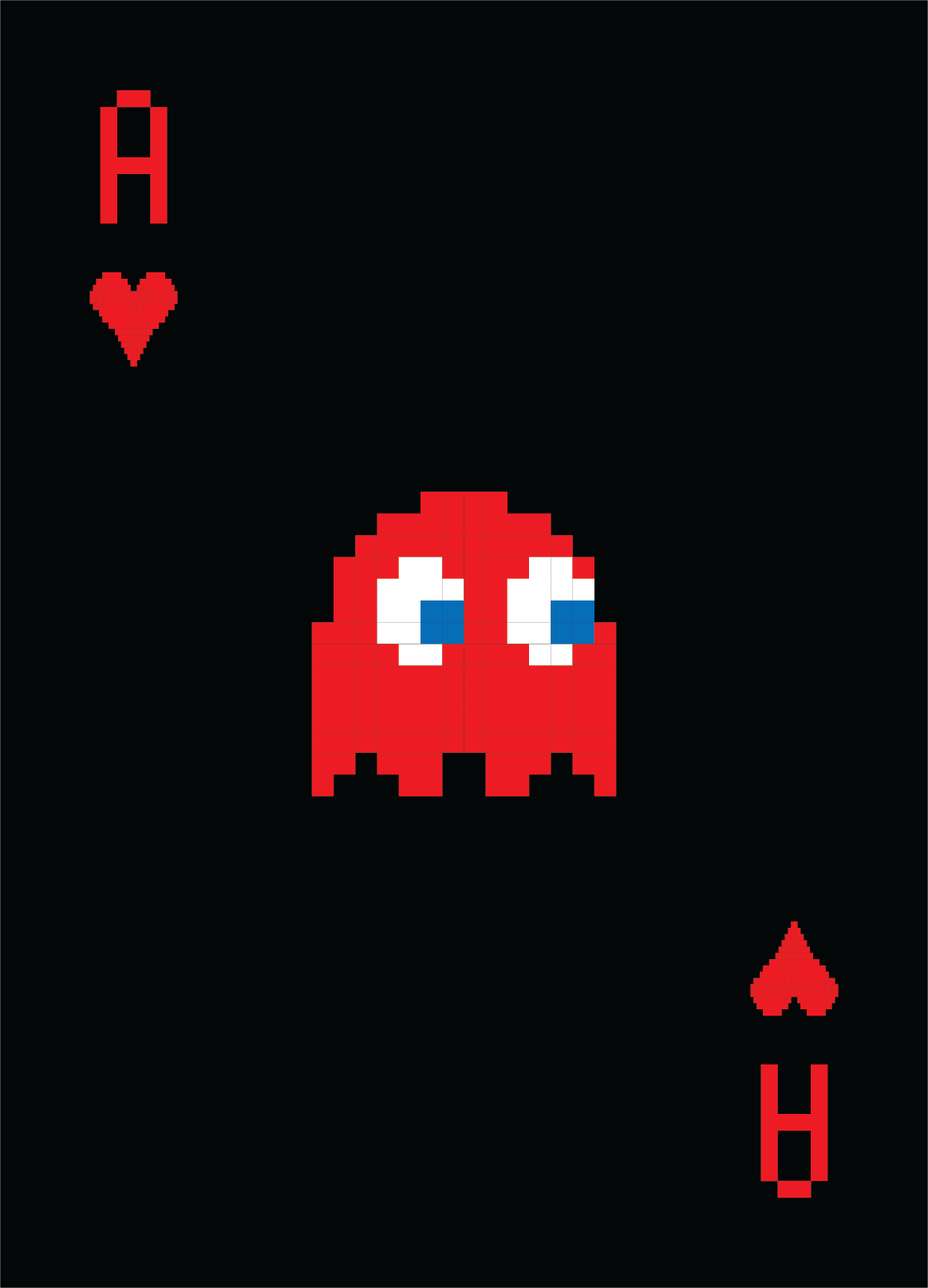
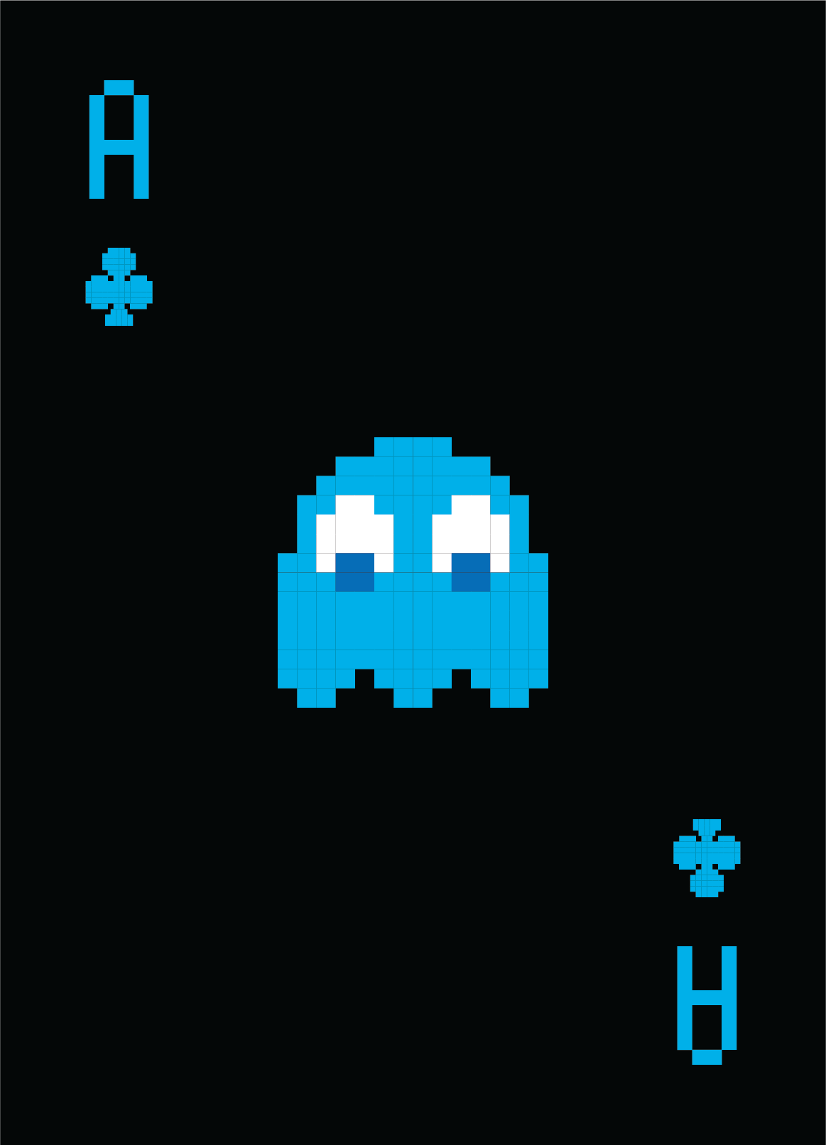
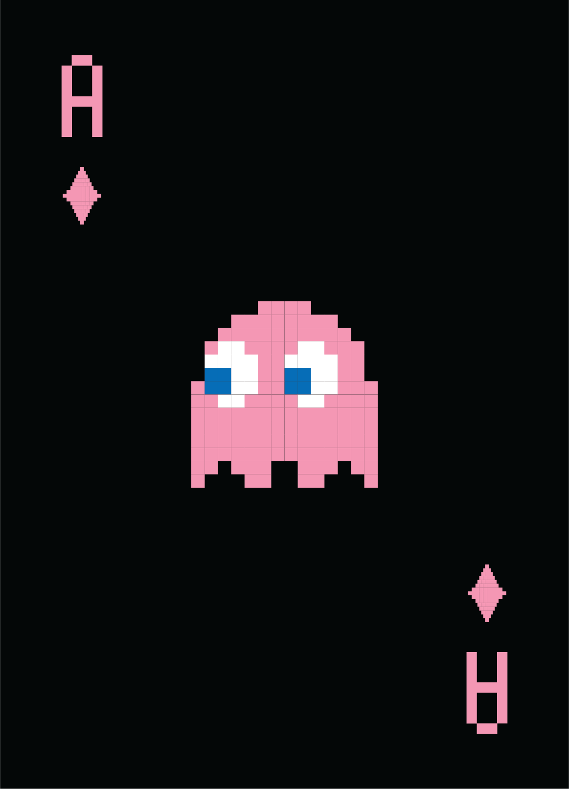
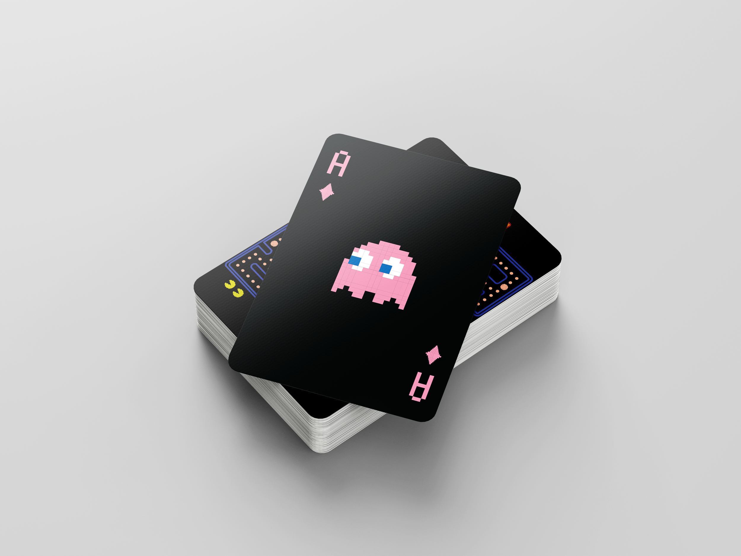
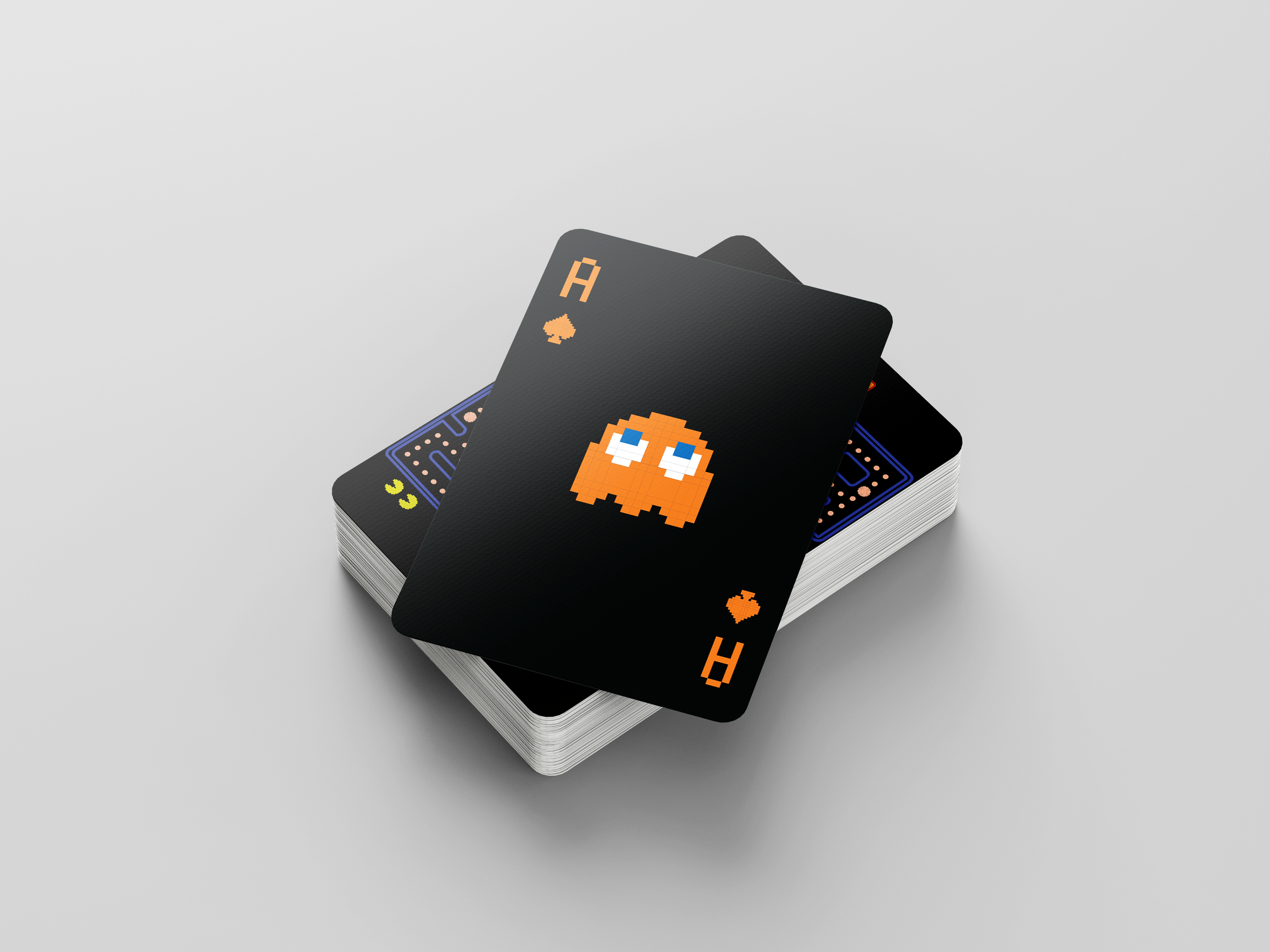
Prompted with the challenge of designing an entire deck of cards, this project was an exercise in both graphic design and developing engaging packaging related directly to the product. I knew instantly I wanted to play with rich, vibrant hues and experiment with a black background versus a traditional white card. Then, after remembering the iconic quartet of Inky, Blinky, Pinky, and Clyde, I became set on bringing one of the worlds most iconic digital designs and video games to life in print via playing cards: PAC-MAN.
Work inspired by the visual language and branding of PAC-MAN by ©Bandai Namco Entertainment Inc.
Designed in Adobe Illustrator and Adobe Photoshop.
Ideation
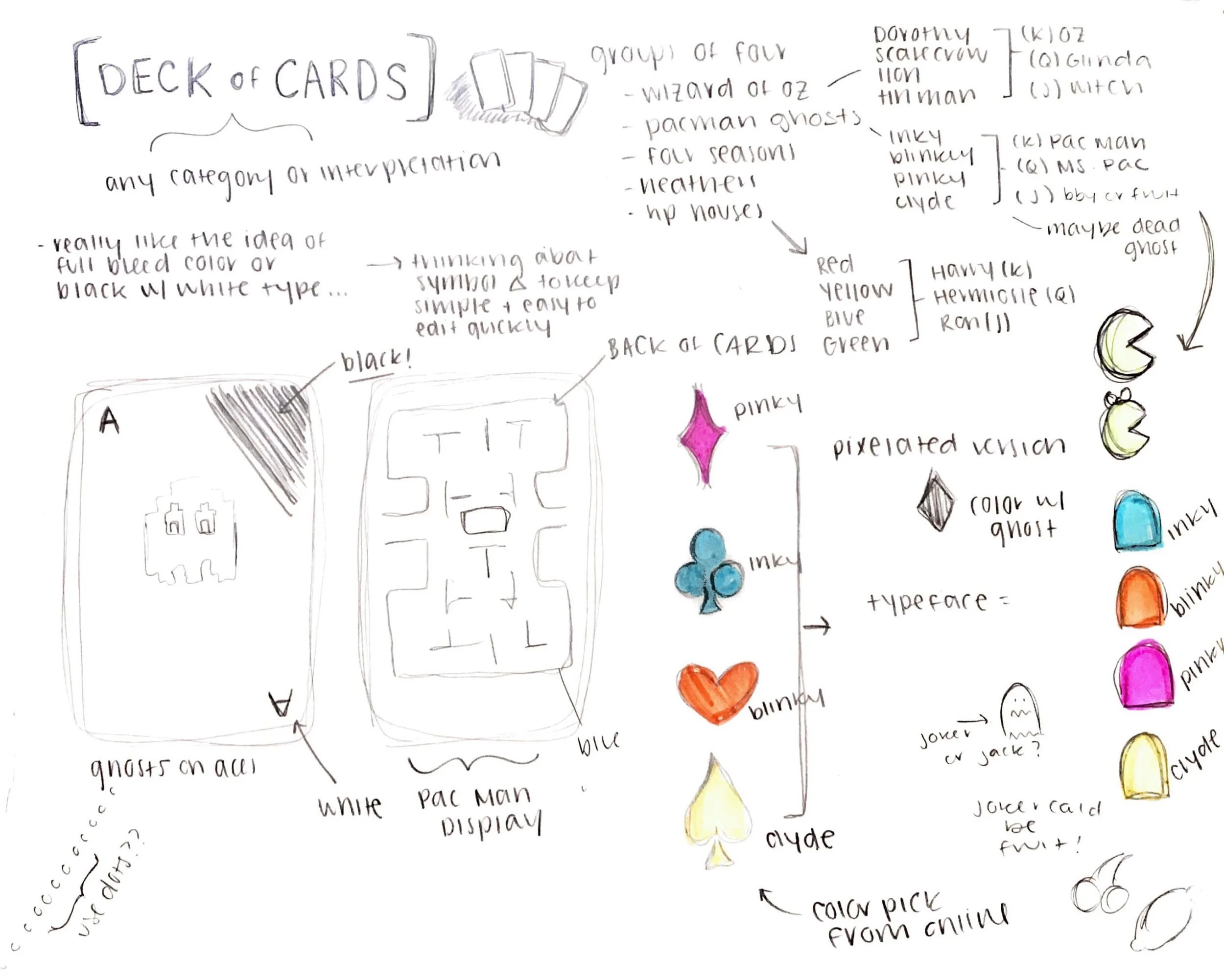
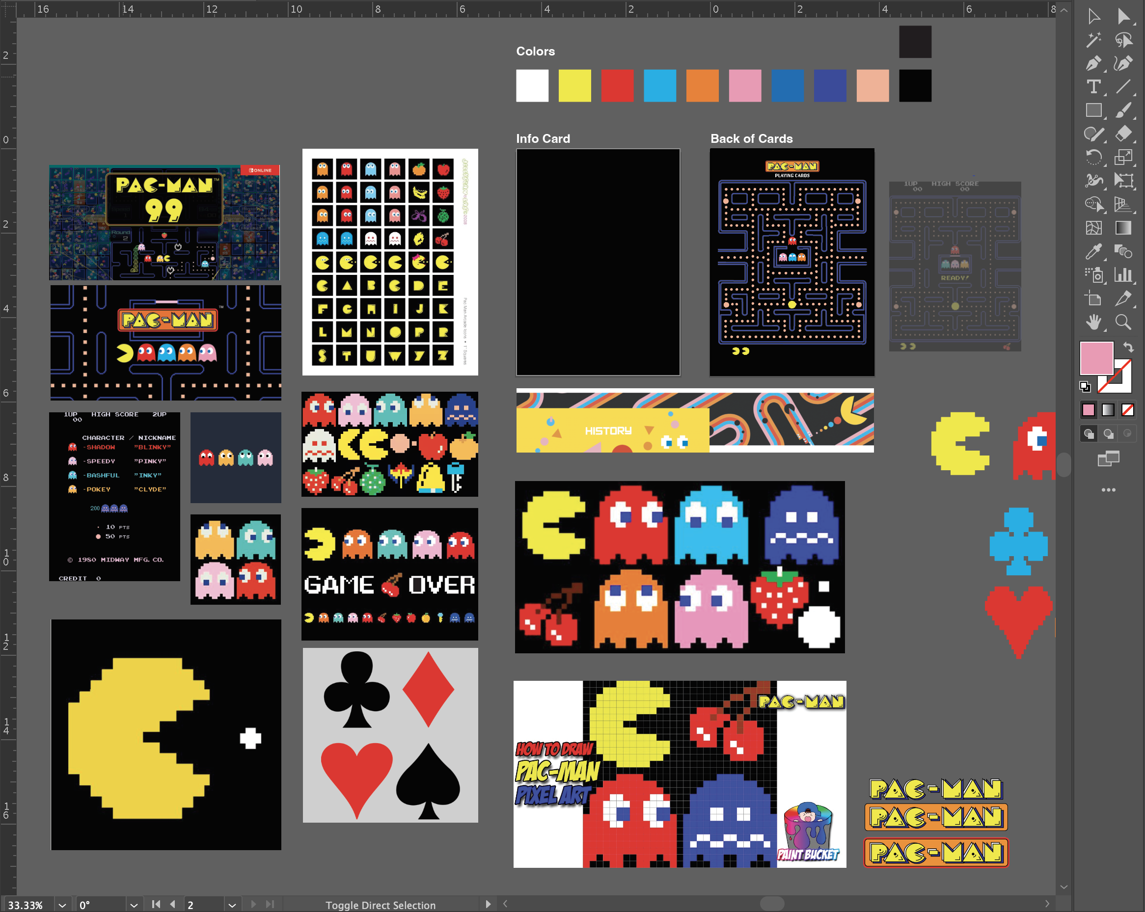
With a fast turn around for this project, I quickly brainstormed on paper, defined my organizational scheme, and got to work referencing a standard deck of 52 playing cards to build my own deck. I referenced the official PAC-MAN website and gathered a variety of inspiration to inform my final approach.
Symbols & Character Development
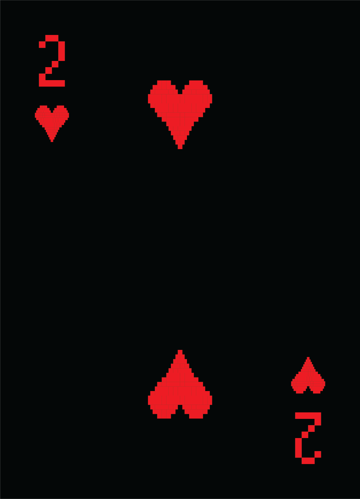
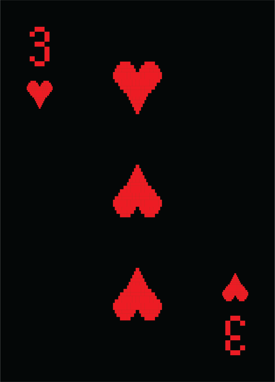
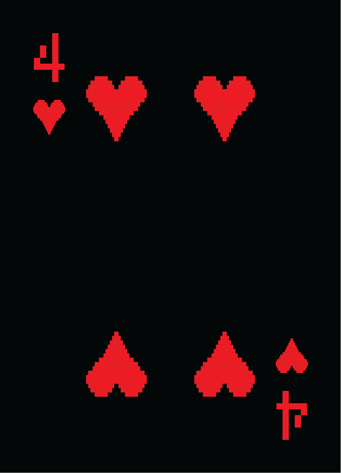
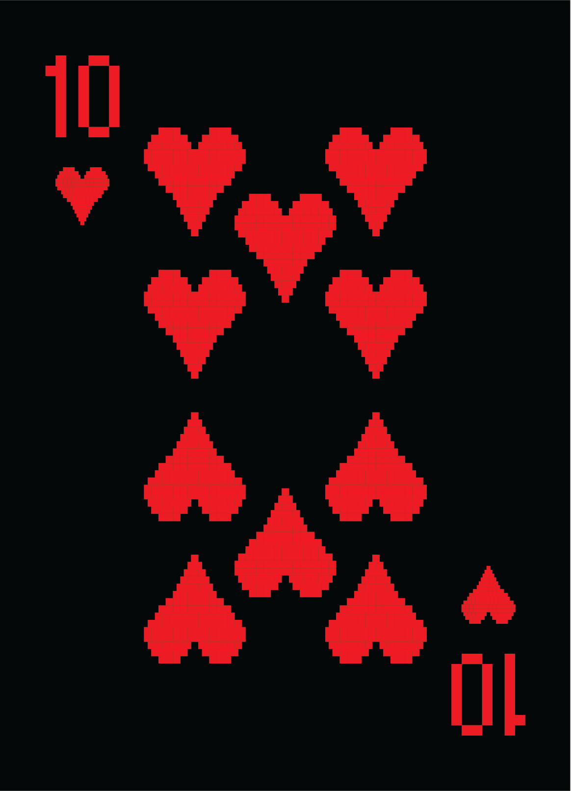
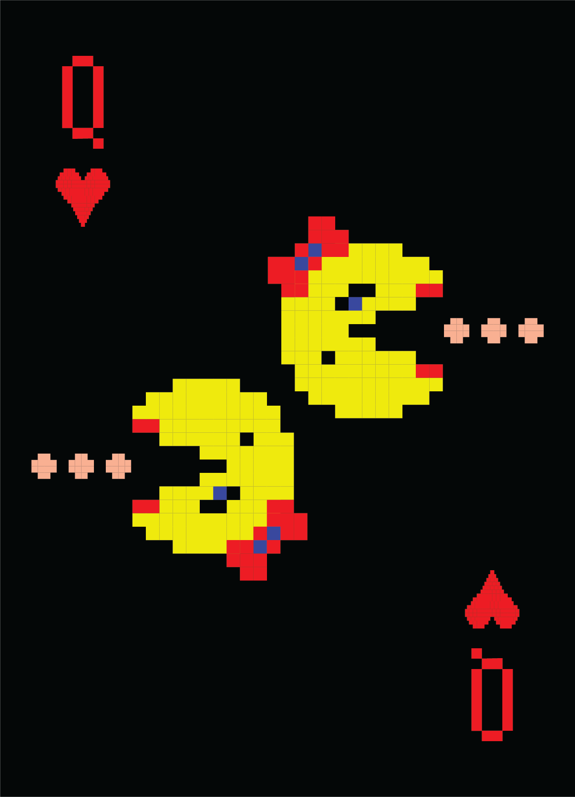
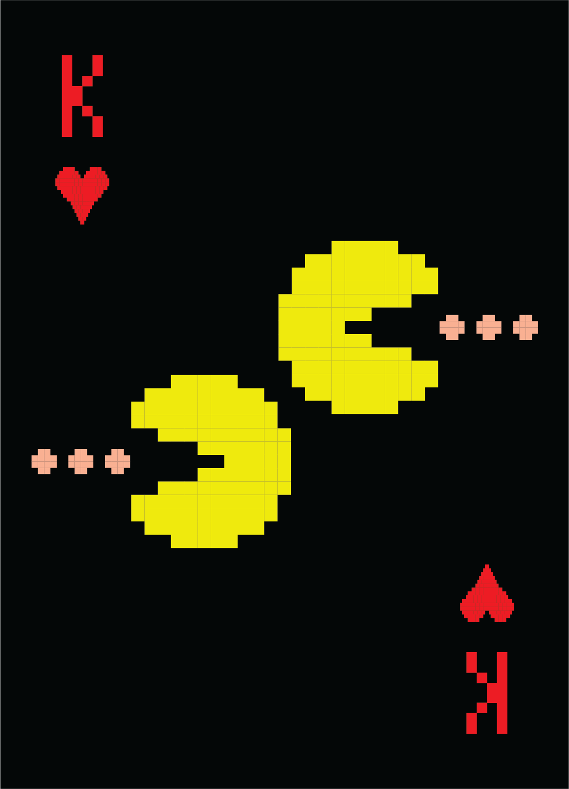
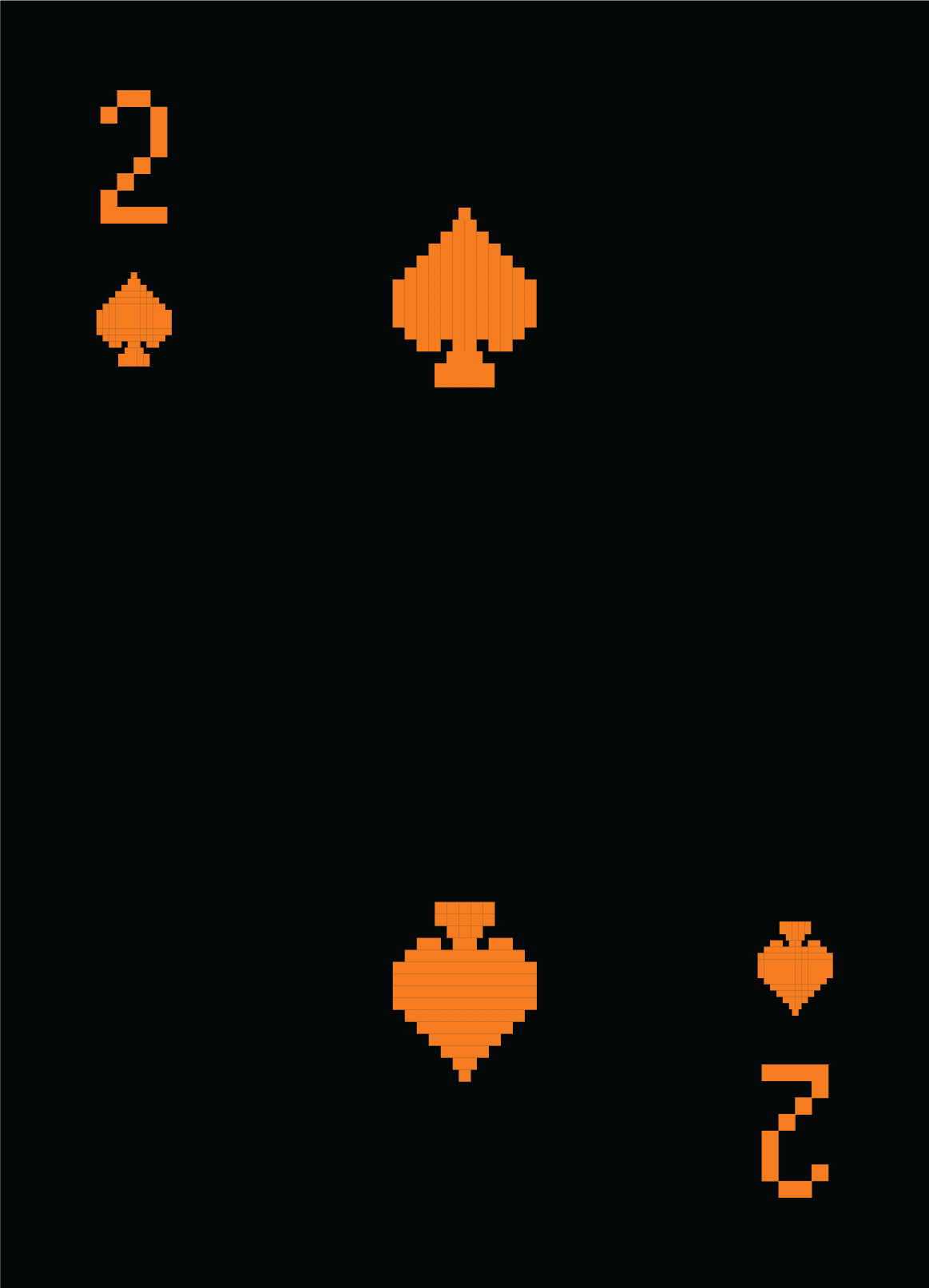
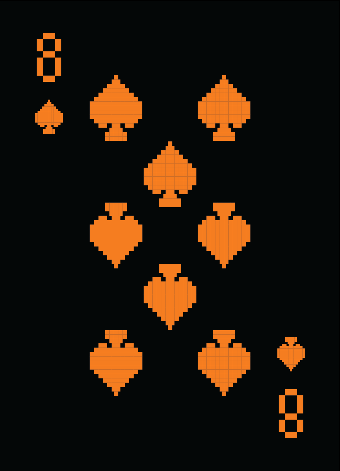
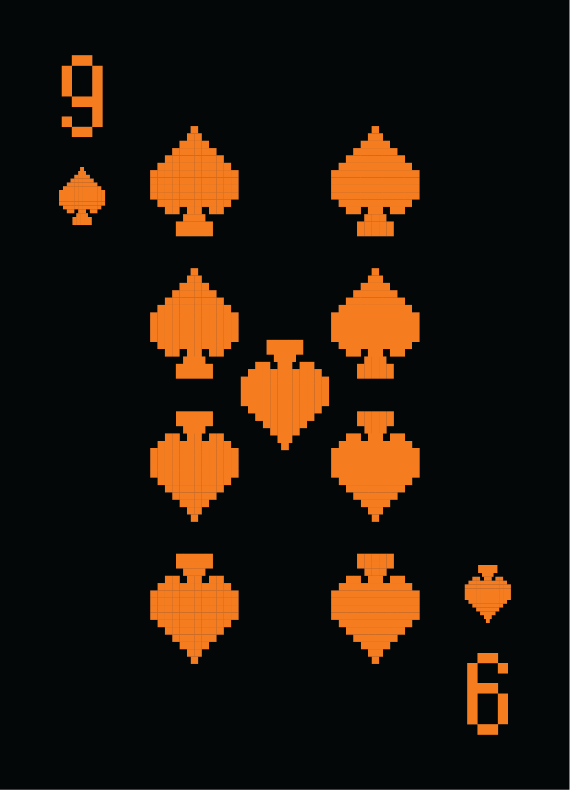
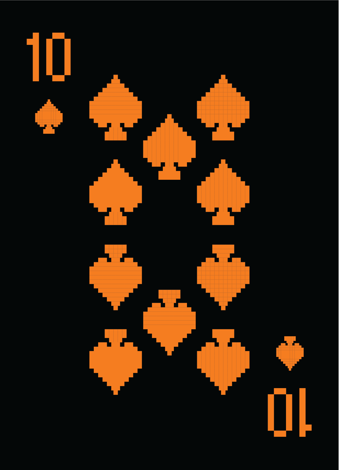
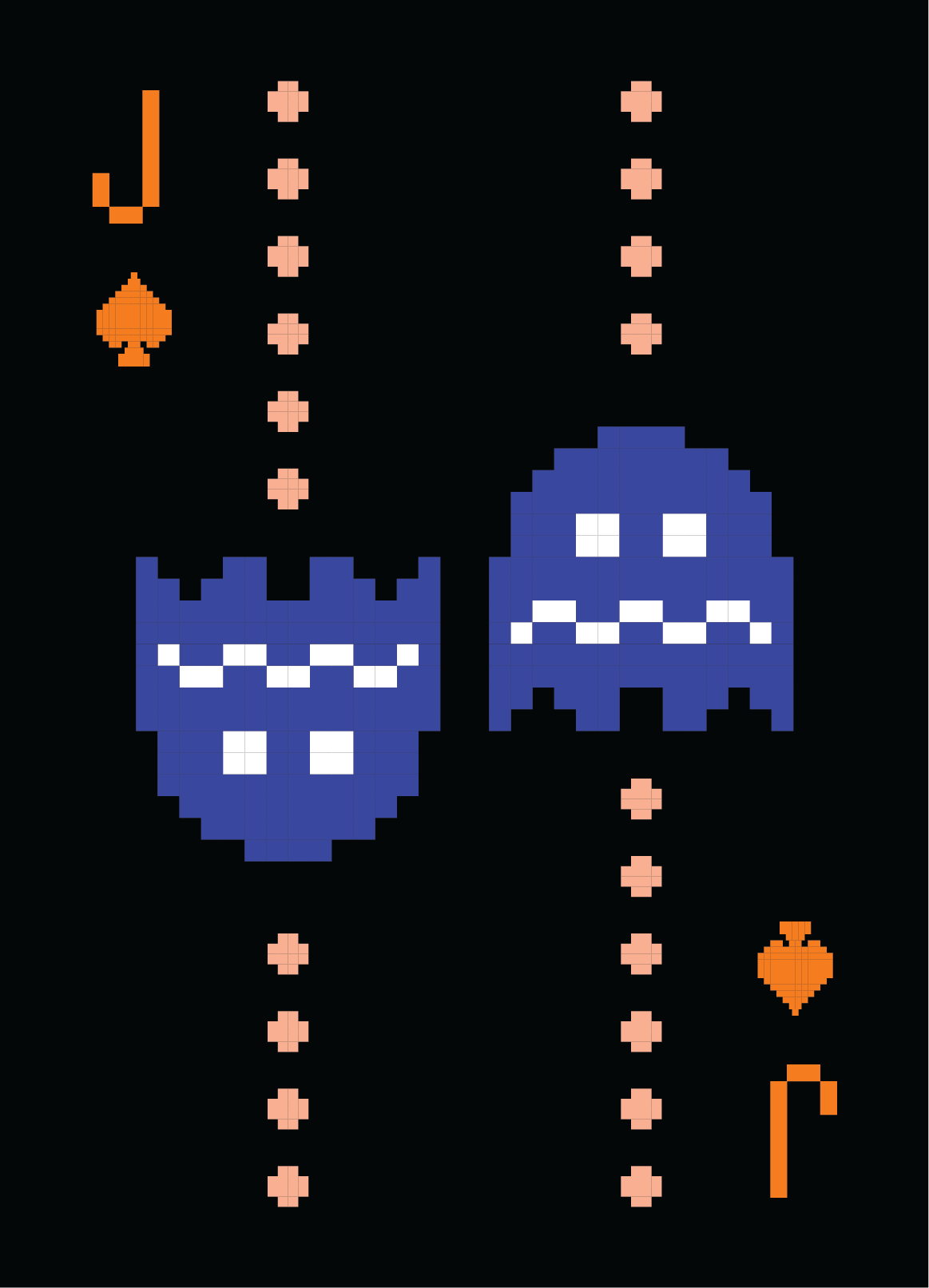
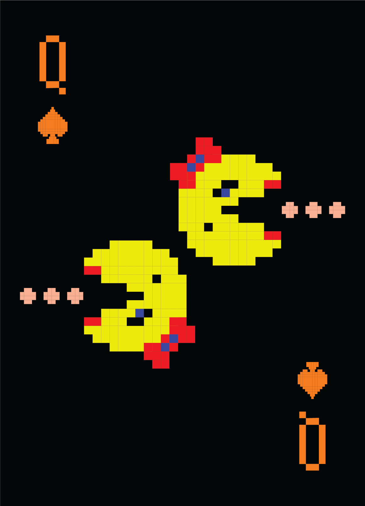
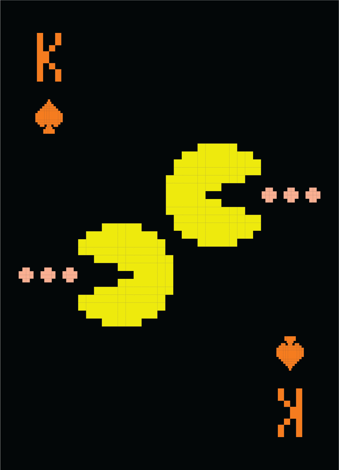
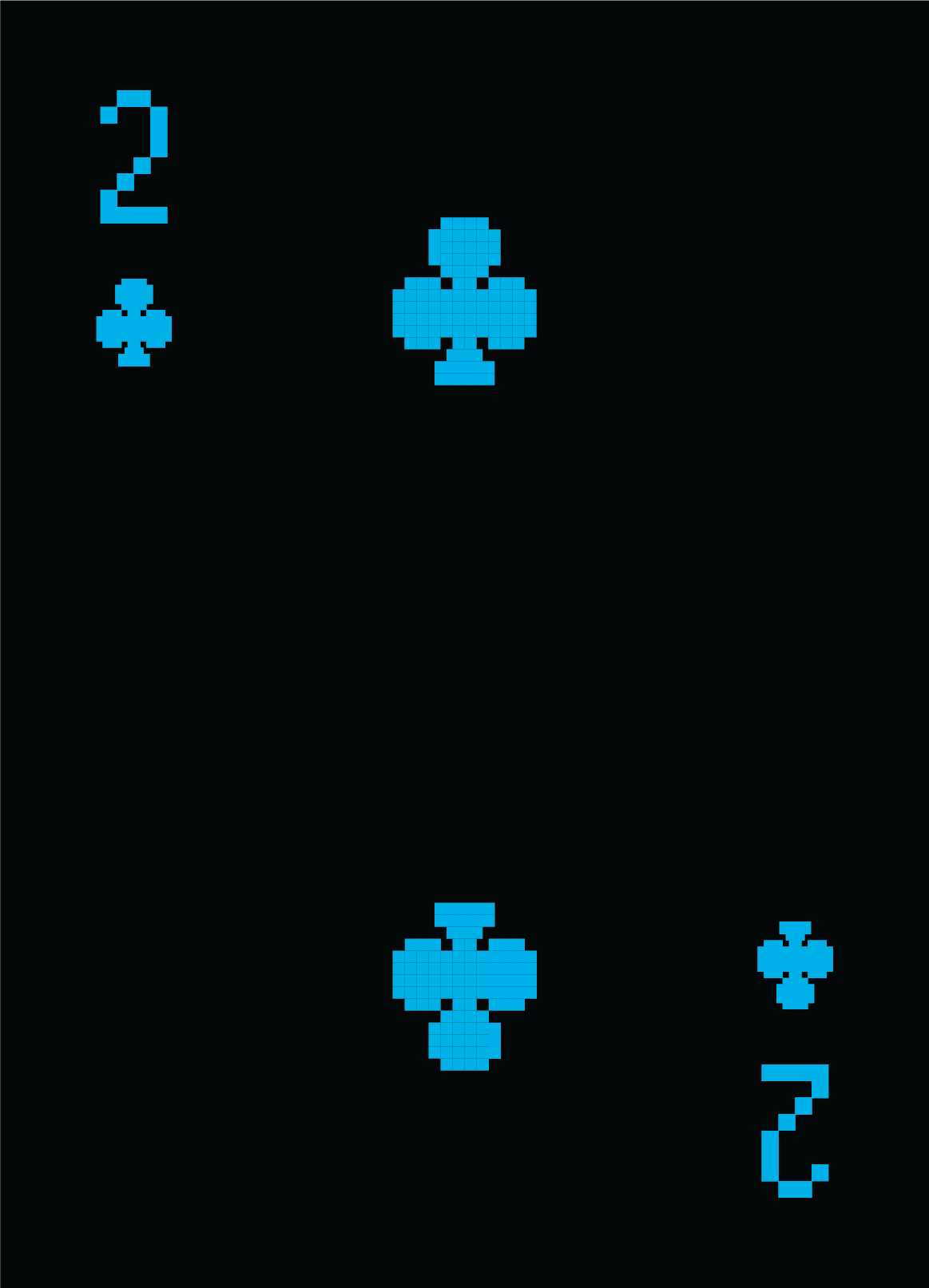
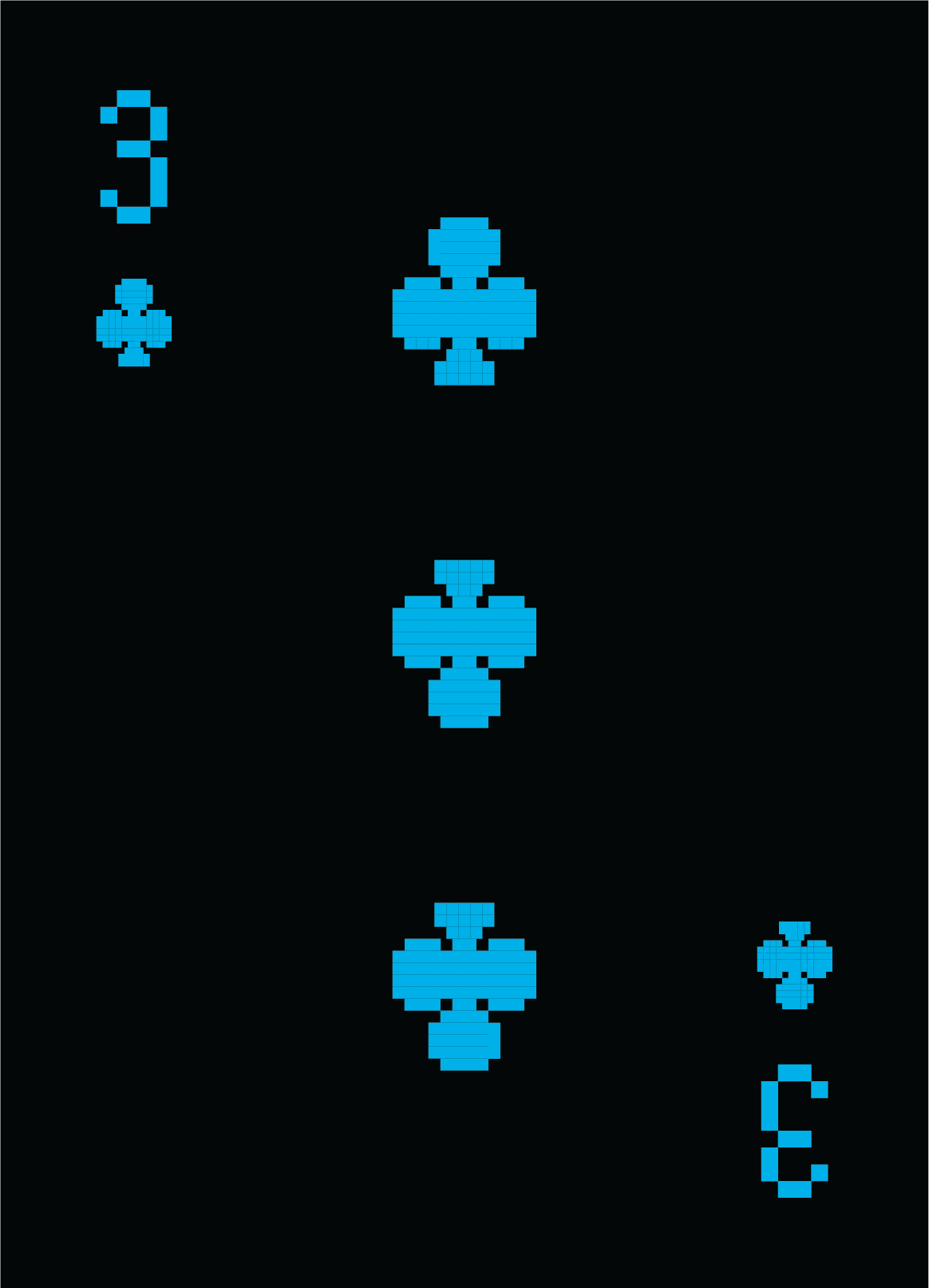
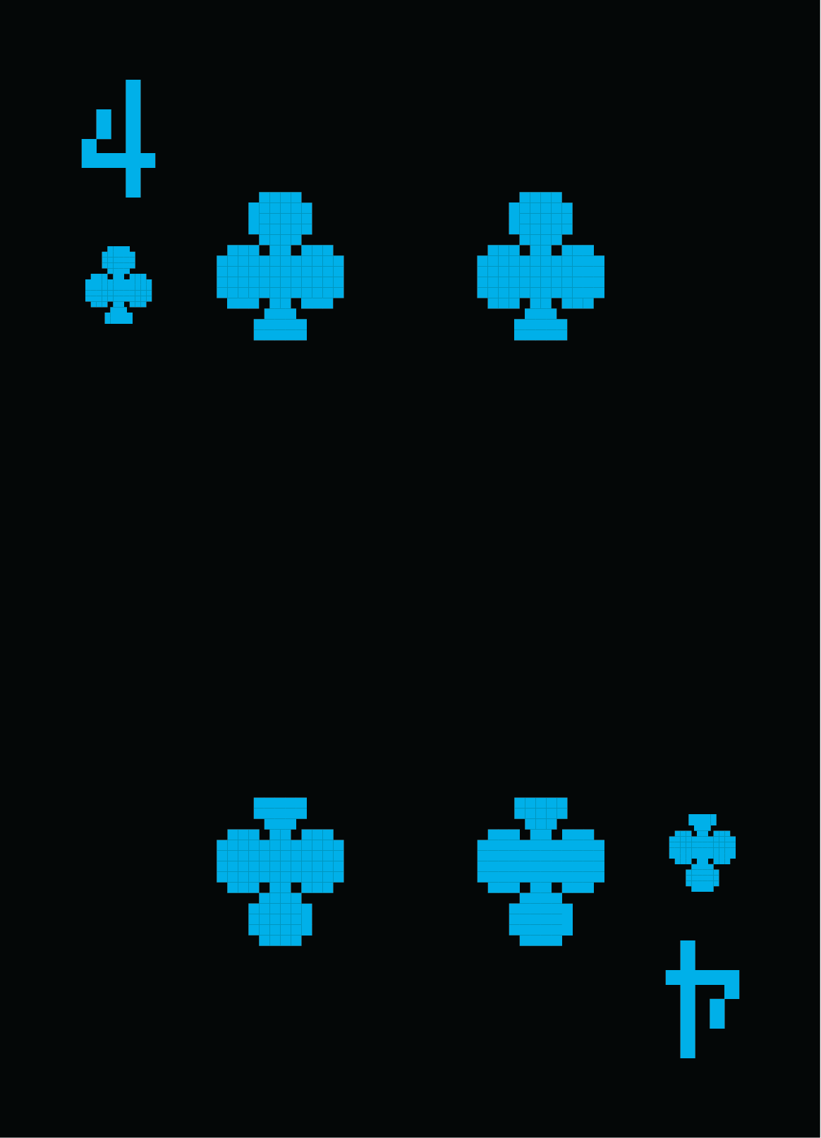
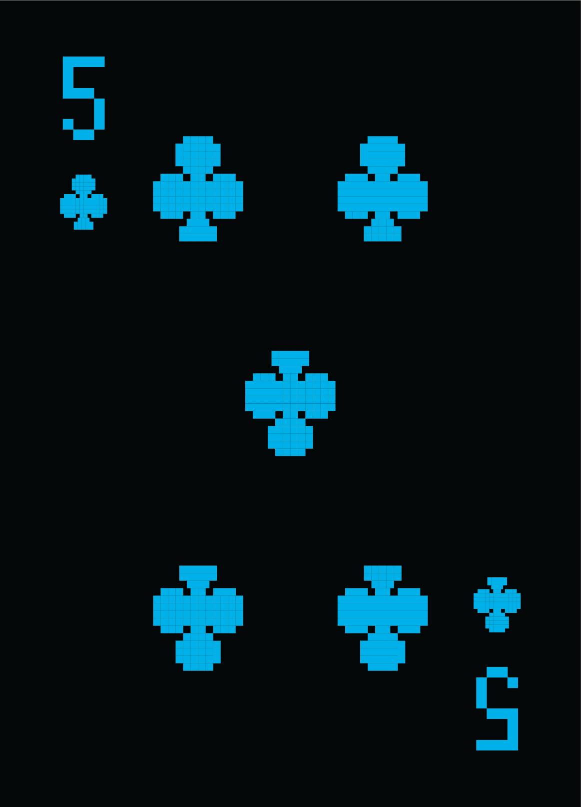
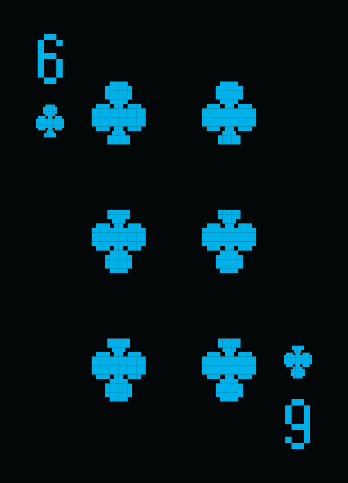
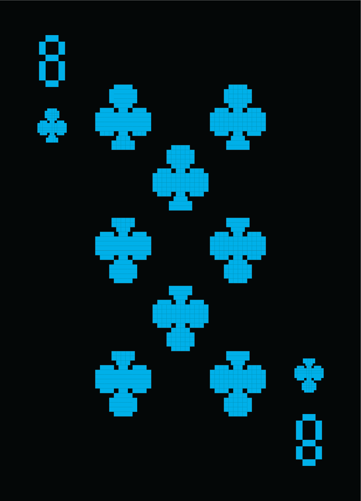
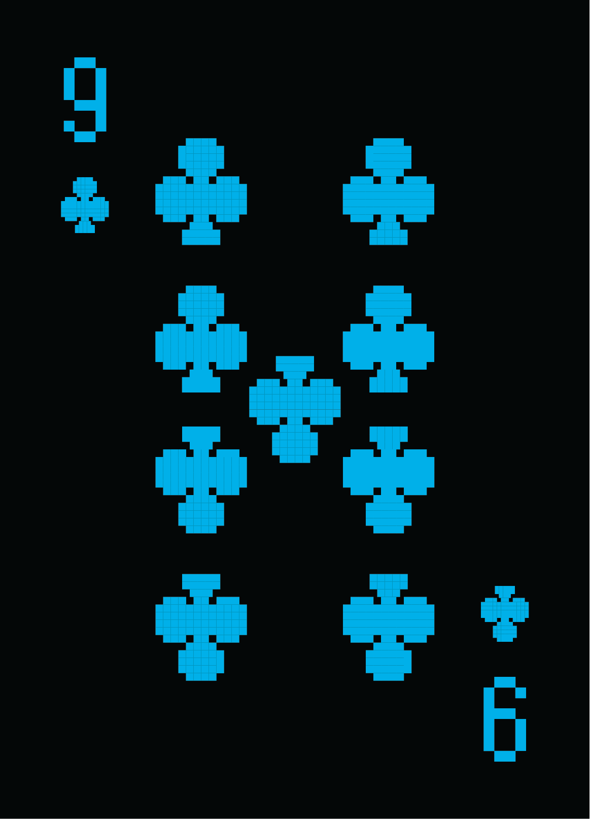
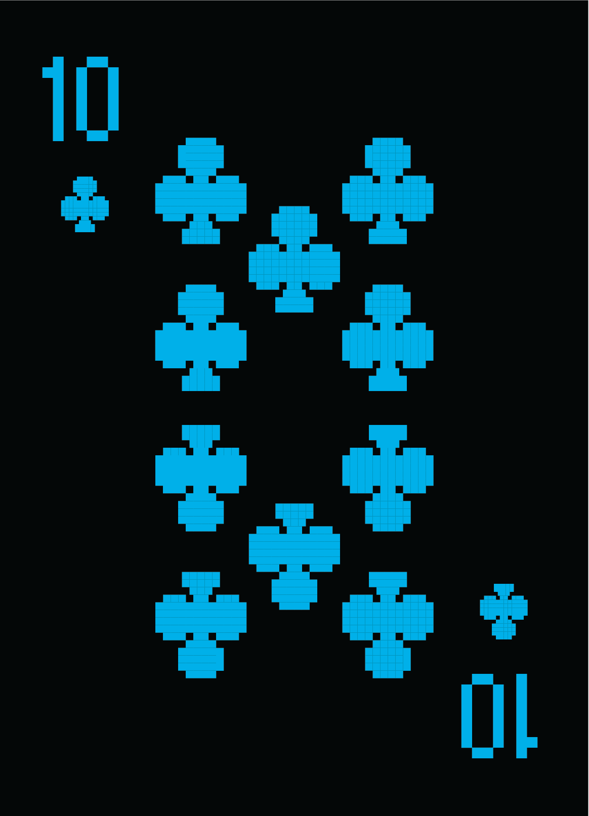
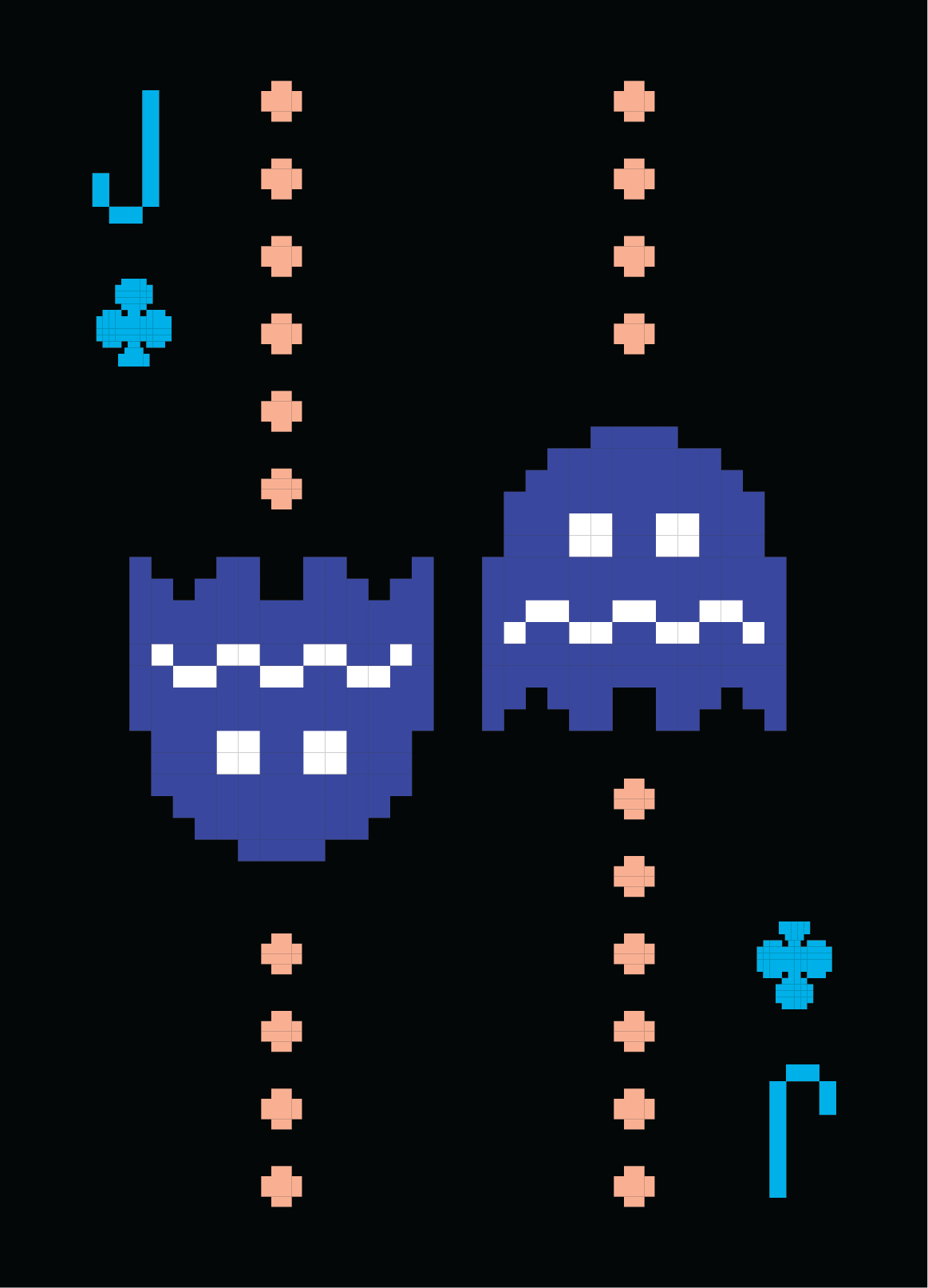
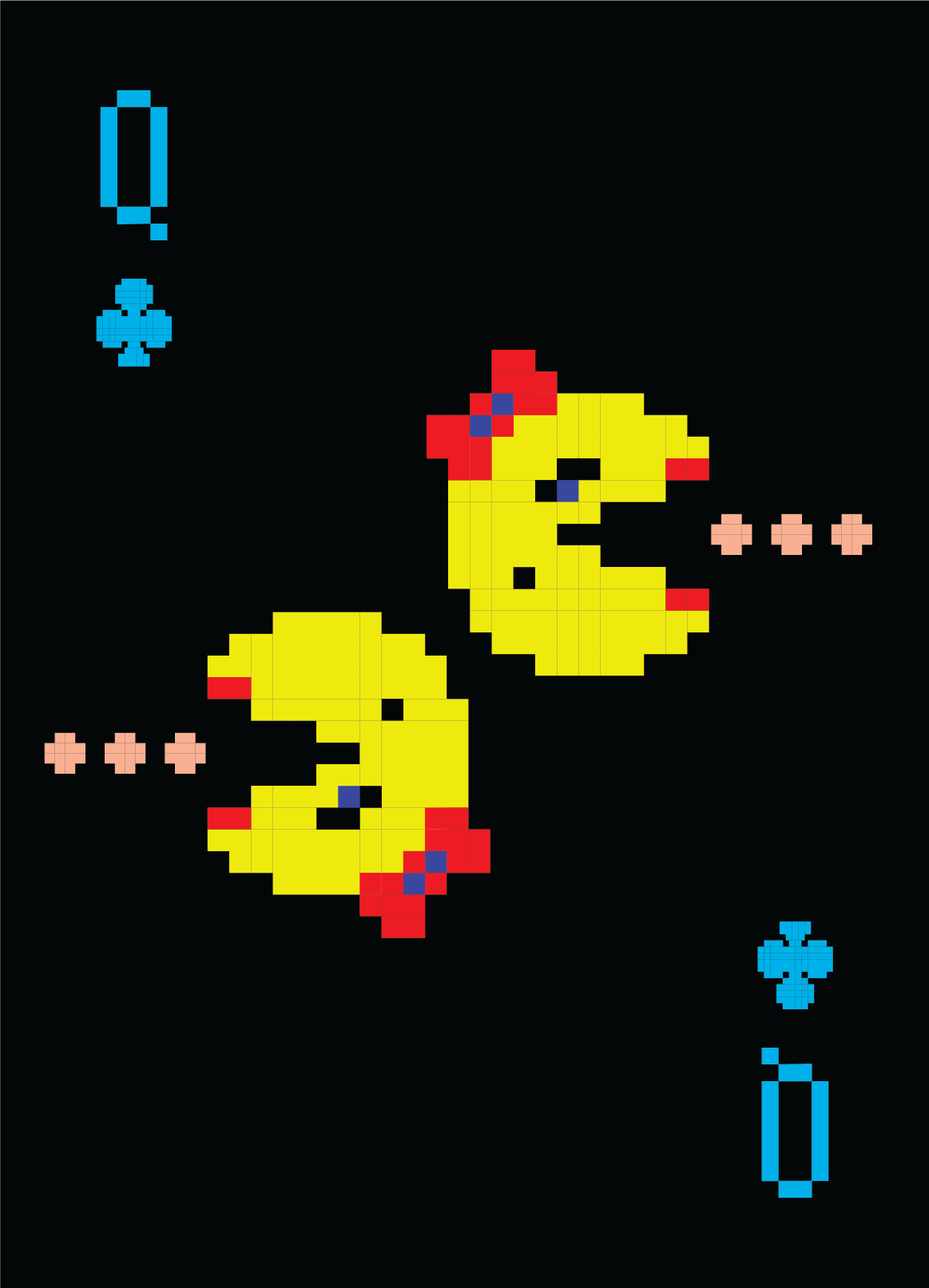
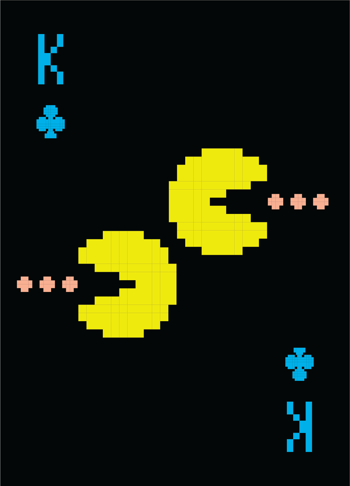
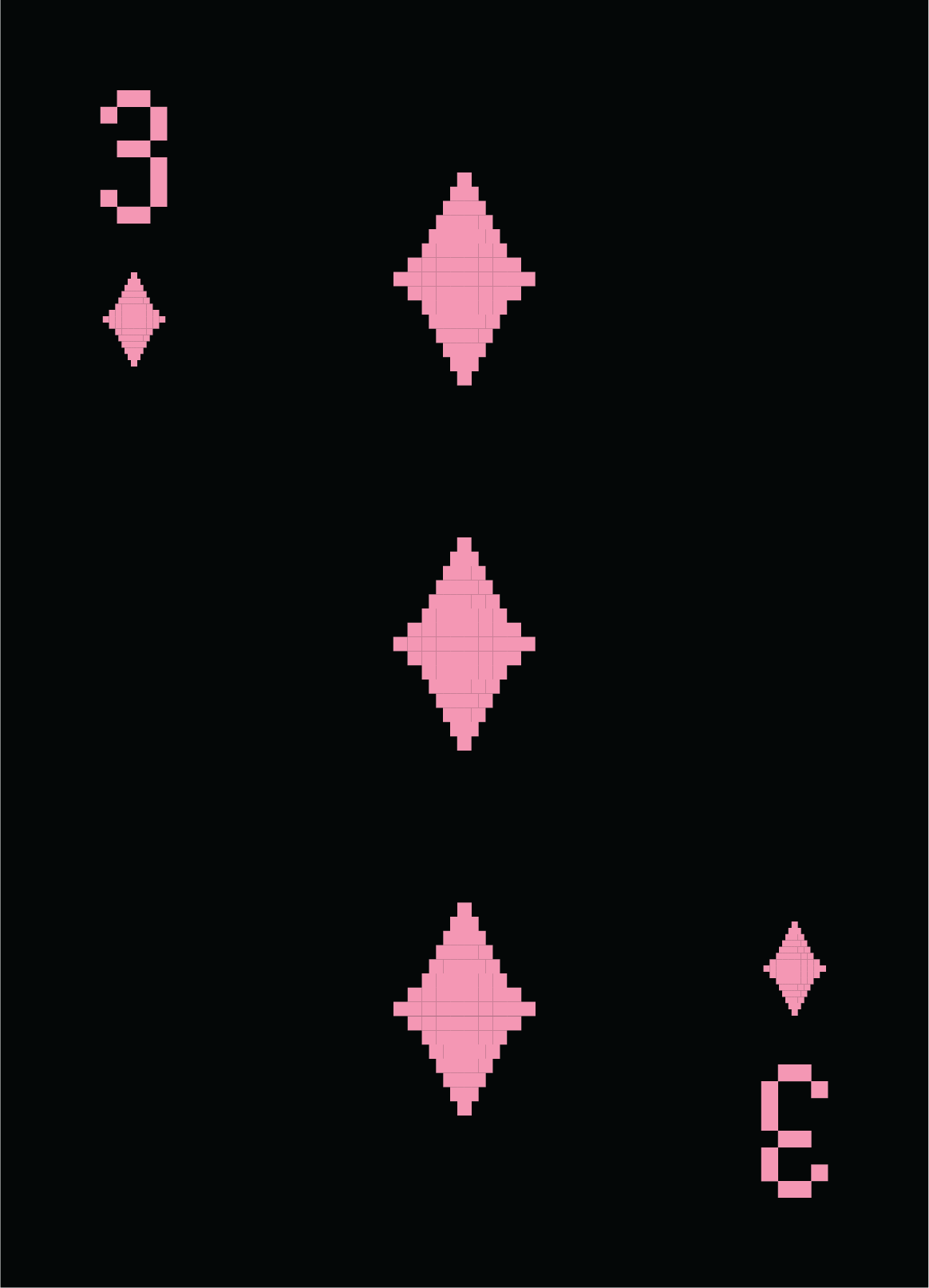
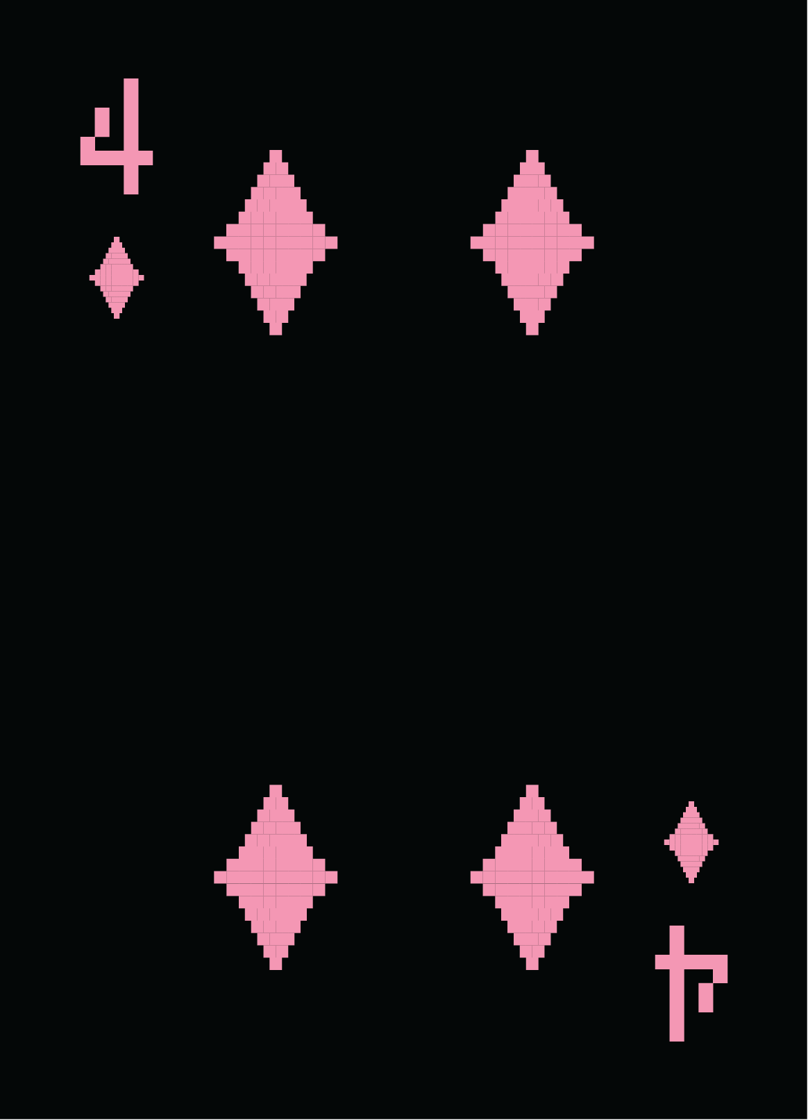
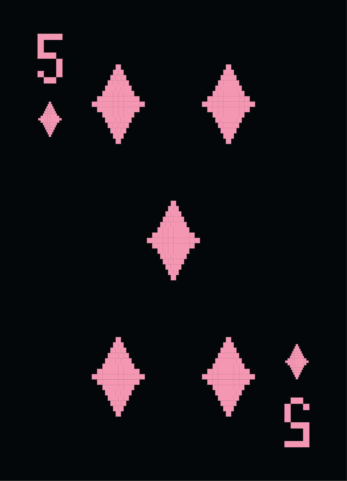
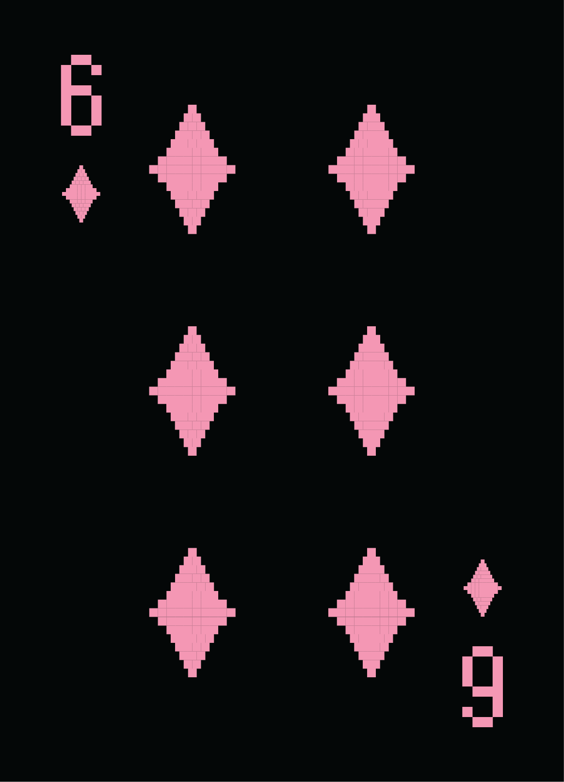
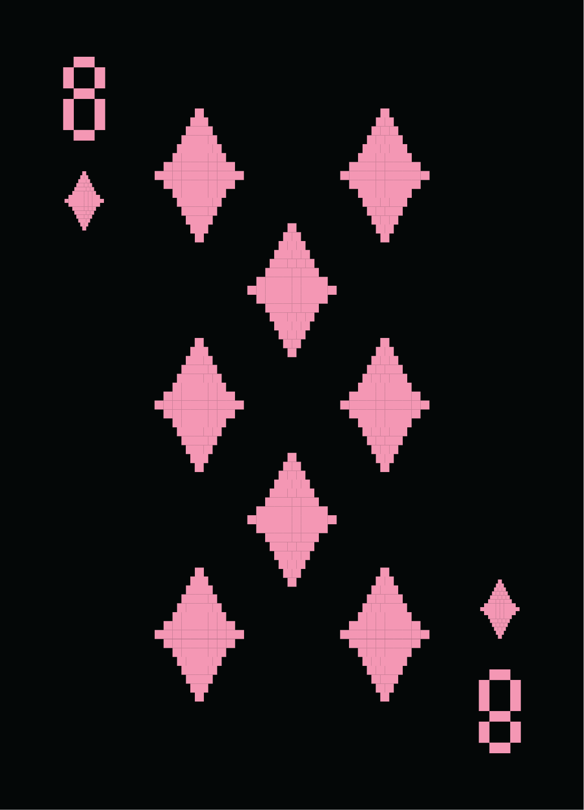
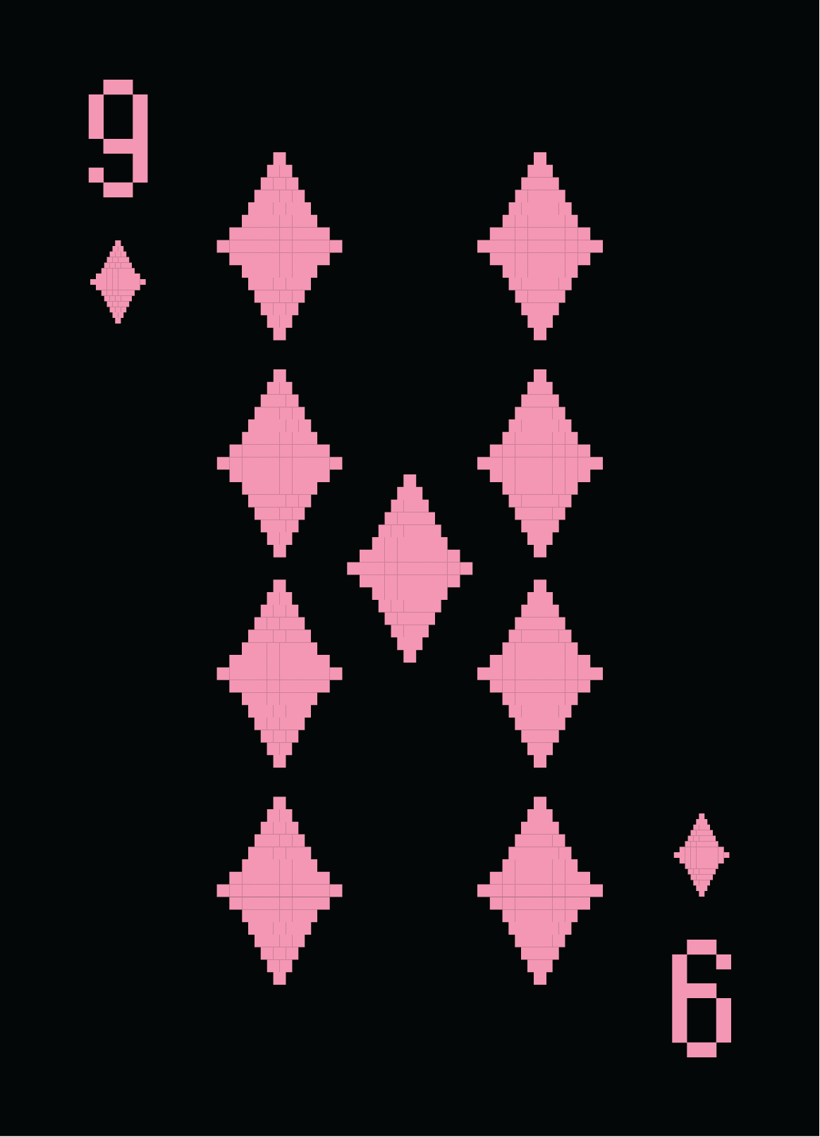
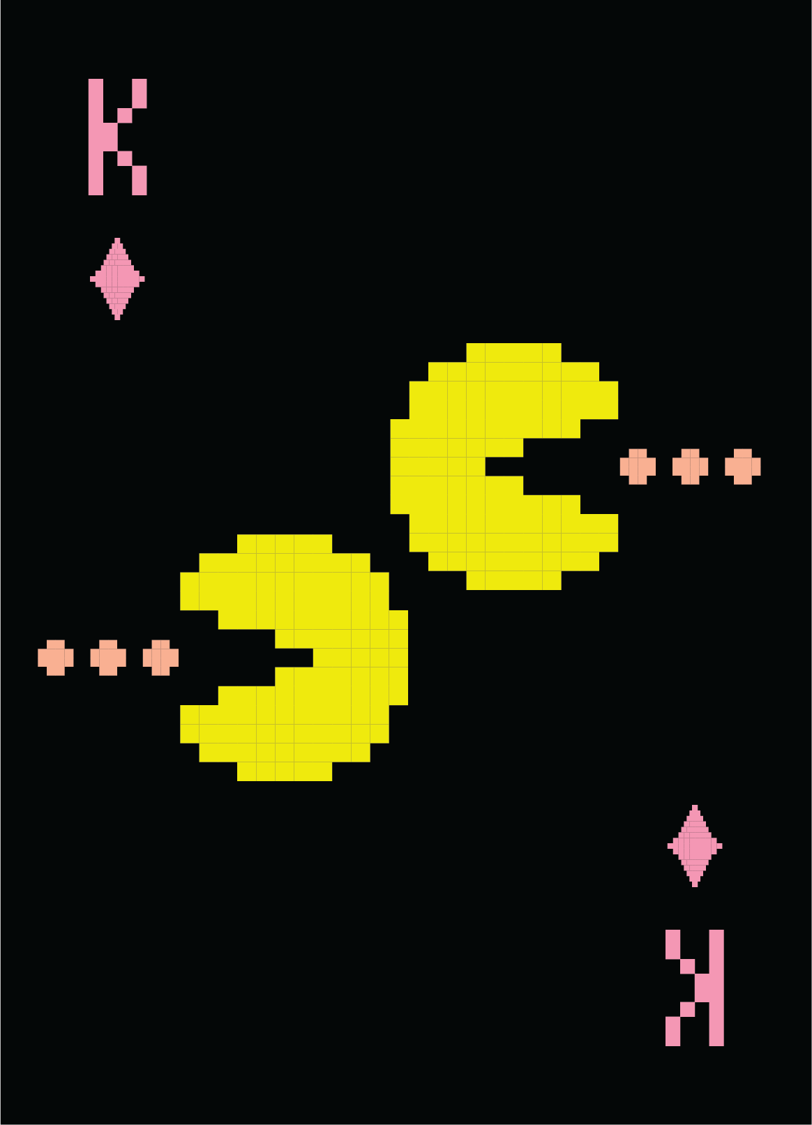
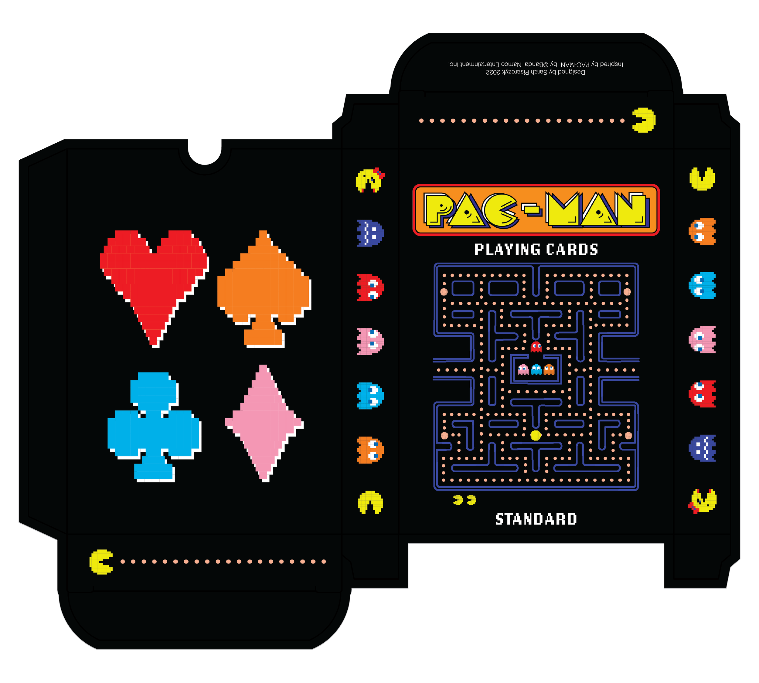
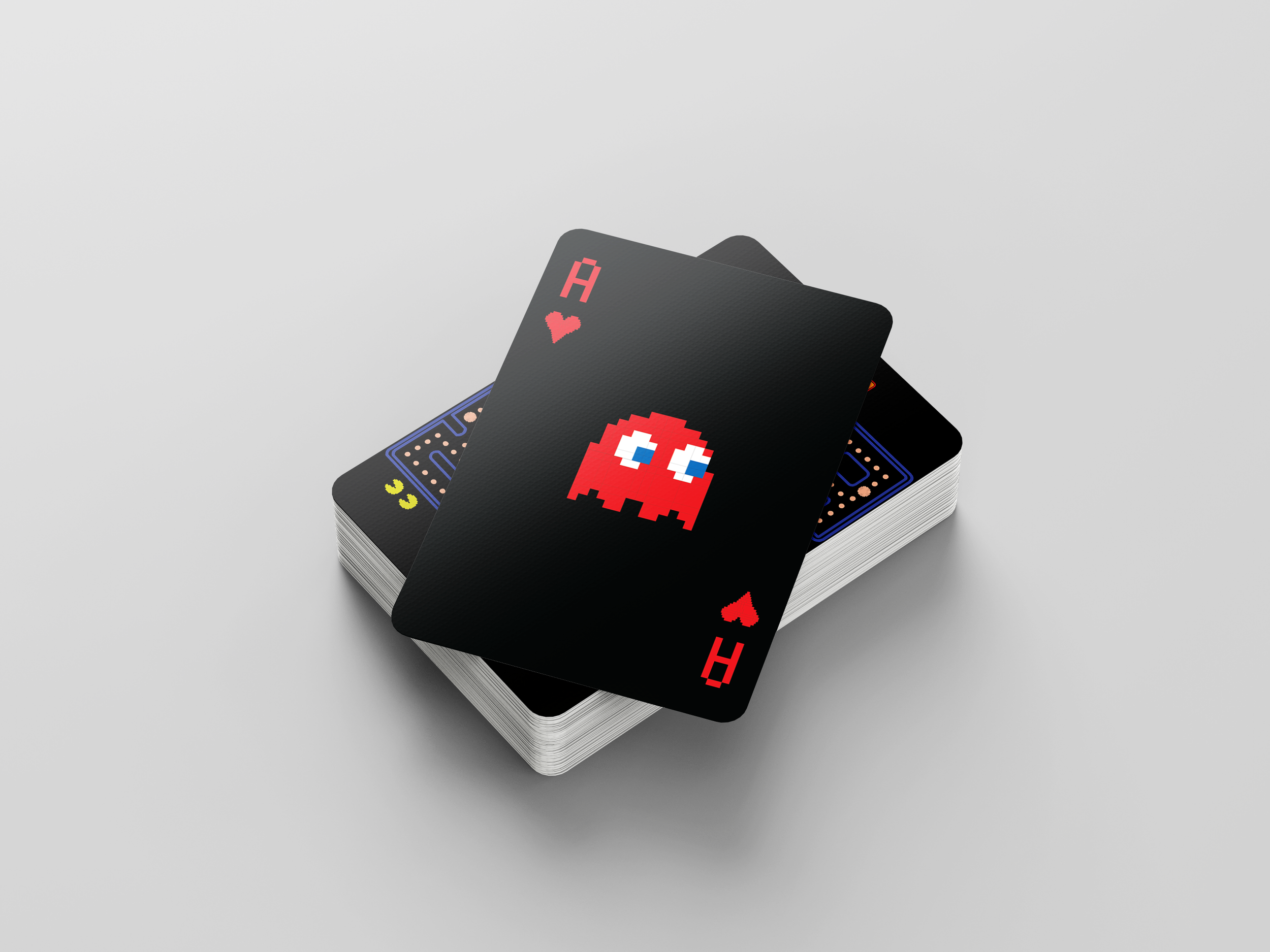
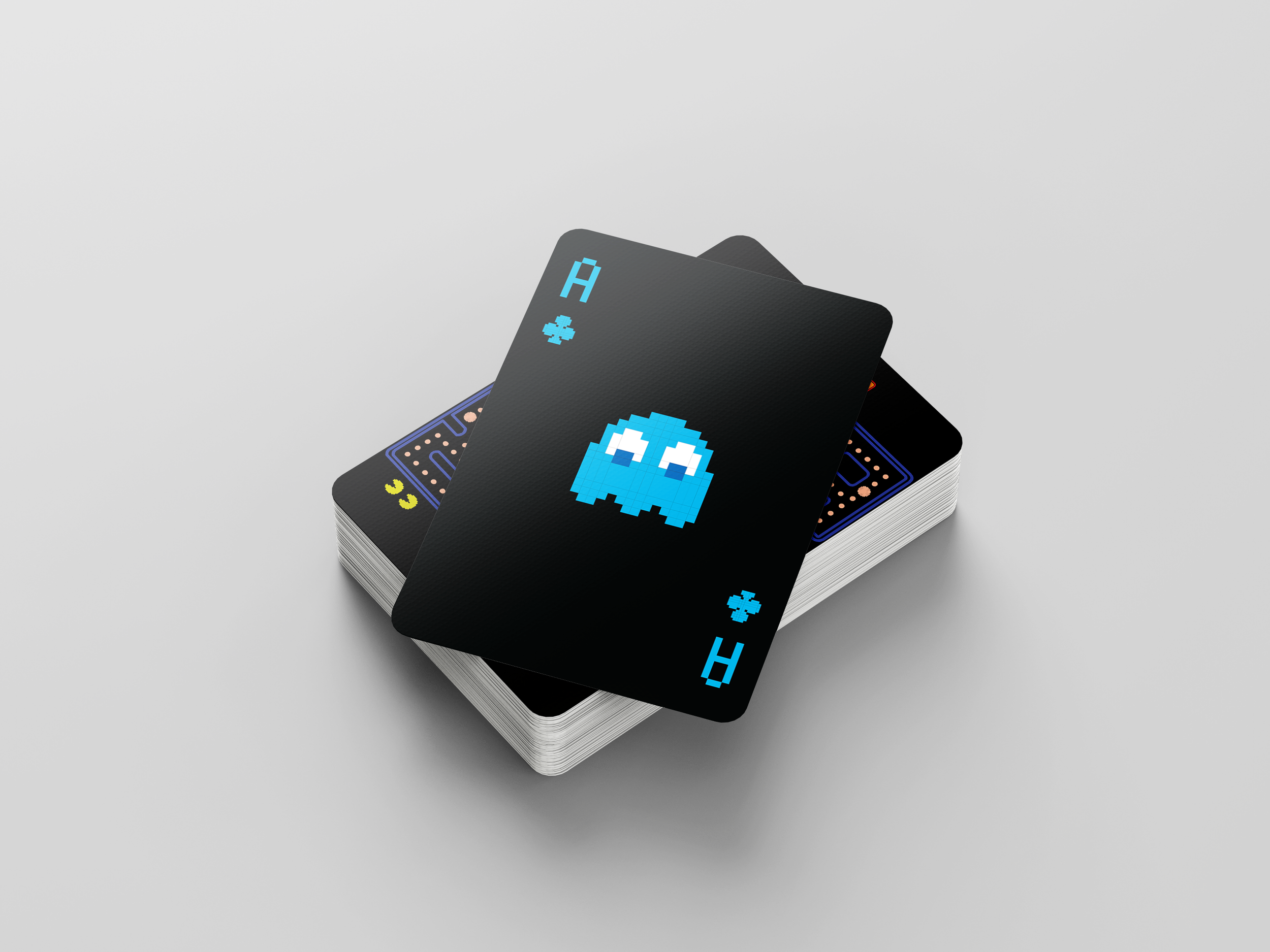
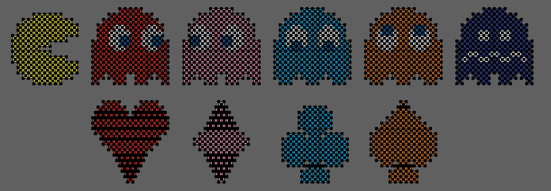
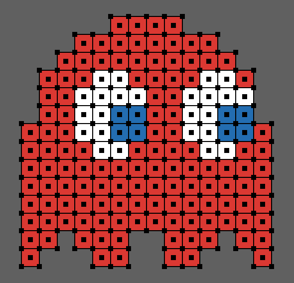
Drawing inspiration from the iconic bitmap illustrations of the original game, I recreated the four suits of a standard deck of cards (hearts, clubs, diamonds, and spades) in addition to re-illustrating PAC-MAN, Ms. PAC-MAN, and the dead ghosts as my king, queen, and jack respectively.

Box & Display Illustration
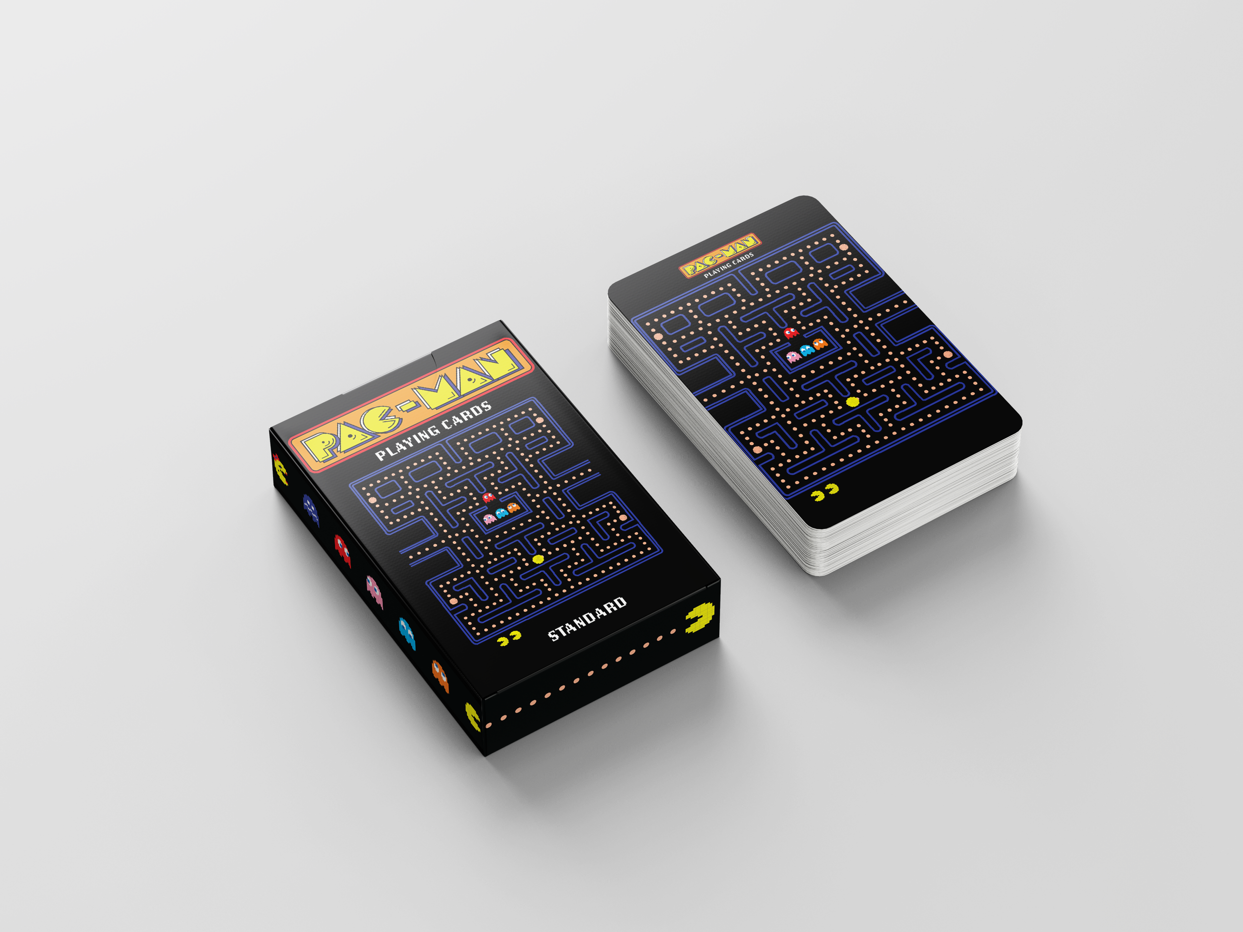
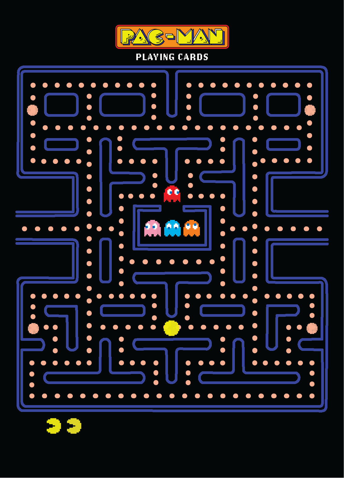
For the box and back of the card, I tied in the infamous PAC-MAN screen, seen when playing the game. It was imperative a full black bleed set the tone for the packaging and back of card as what people so strongly associate with the original game.
Final Deck
The final deck of cards came together to form a cohesive set, meeting my project brief and personal goals of experimenting with color and an illustration style which evoked the delightful nostalgia of PAC-MAN.
